Tim Jarvis
The Pressery
_14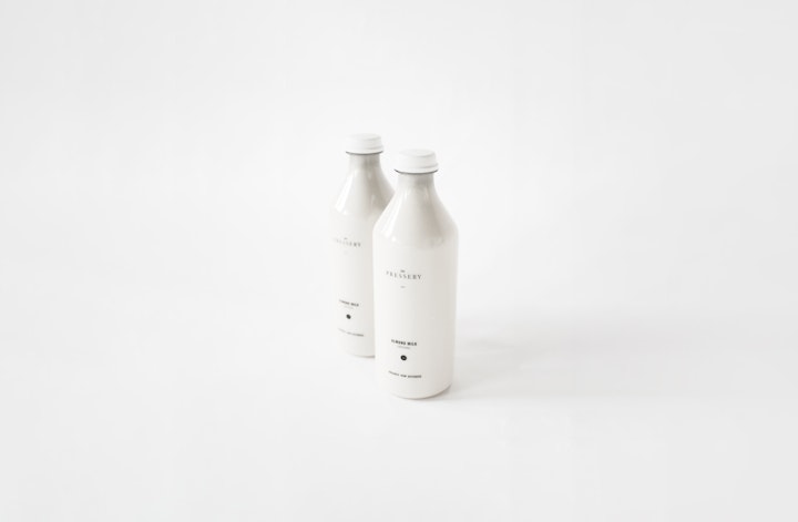

The Pressery
_14
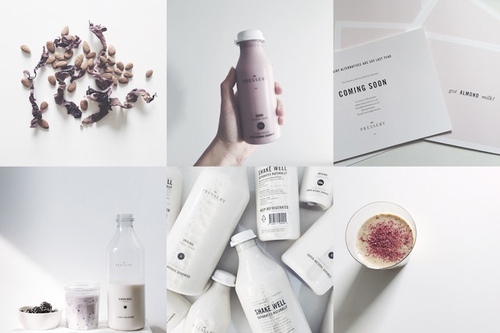
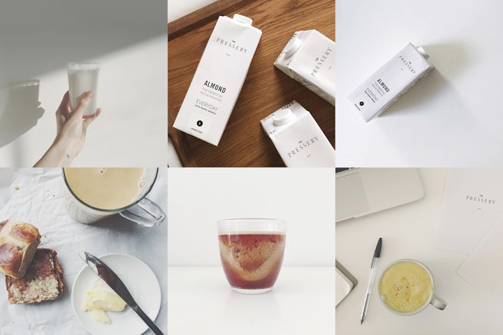
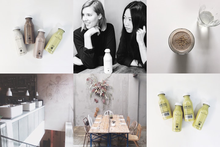
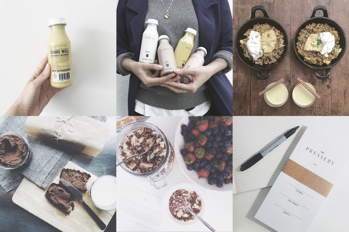
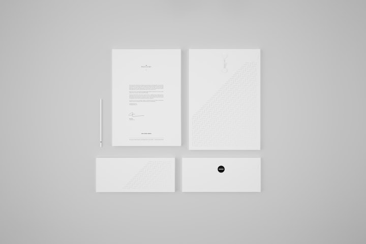
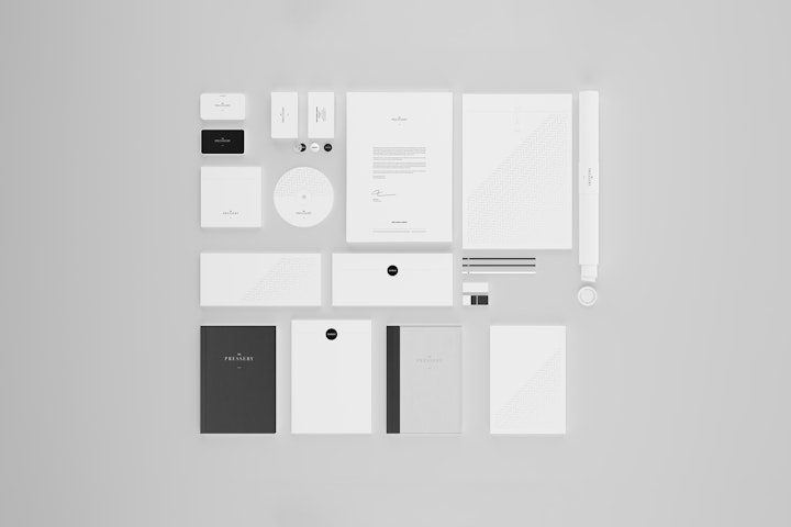
The Pressery was born from the love of whole foods and their health benefits. In this; the first stage of the branding process, the identity and original product range are defined and launched. Branding for the new company was an exercise in complete minimalism to reflect the pure values of this unique hand-made product. No ingredients are used that aren't required and as such there are no elements to the identity that aren't absolutely necessary. The logo typography is a reworked, balanced version of Sabon LT paired with condensed Trade Gothic LT. Given space to breathe, the logotype always appears adequately padded by a sizeable negative space square; a visual metaphor that nothing is allowed to compromise the absolute simplicity and purity of the product.
The corporate identity features a logomark comprised of two parallel line; symbolic of the two founders. These lines are used as a visual style asset throughout the stationery and in some special circumstances are presented alone with no other elements.
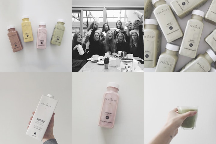
Launched in spring 2014 the branding work has been showcased in Kinfolk, Monocle, Wallpaper and throughout the national press. The Pressery almond milk is now stocked in several leading UK organic grocery outlets and is still made by hand in small batches in East London.
One of The Pressery's fundamental motivations is to create a healthy alternative to dairy milk; a product that has suffered from decreasing quality through farming and methods of production. The bottles suggest traditional dairy milk bottles, further confirming that a product of this quality is a perfect replacement for dairy milk that so many people accept as a part of their daily lives.
__________________________________________________
Recognition
14.06 Behance Featured Project
14.07 Trendhunter
14.08 The Dieline
15.01 Start Me Up!
15.03 Winner 2015 Creativepool Annual
15.03 AdWeek Talent Gallery
15.03 Minimalissimo
15.08 AIGA Cased Shortlisted
15.10 Packaging Design Served

